
Introduction
Color plays a crucial role in interior design as it has the power to affect our emotions, moods, and overall well-being. When it comes to decorating your home, choosing the right color palette is essential to create a space that reflects your personality and promotes the desired ambiance. Understanding color psychology can help you make informed decisions and create harmonious interiors that resonate with your style. In this blog post, we will explore the fascinating world of color psychology in interior design and provide practical tips to help you choose the perfect palette for your home.
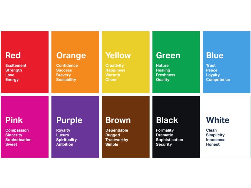
Understanding Color Psychology
Color plays a vital role in shaping our emotions and perception. In interior design, it can greatly impact the overall ambiance and mood of a space. By understanding color psychology, we can make informed decisions when choosing the right palette for our interiors.
The Power of Warm Colors
Warm colors, such as red, orange, and yellow, evoke feelings of energy, warmth, and excitement. They can be used to create a cozy atmosphere in areas like living rooms and dining spaces. However, caution must be exercised as an excessive use of warm colors can lead to feelings of overwhelm or aggression.
Red: Passion and Energy
Red is a powerful color that stimulates energy and passion. It can be used as an accent color to draw attention to certain elements in a room. However, it is important to use red sparingly as it can be overwhelming. Consider using it in areas where you want to create a sense of excitement, such as a feature wall or a piece of furniture.
Orange: Warmth and Creativity
Orange is a joyful and stimulating color that brings warmth and creativity to a space. It can be used in areas where you want to promote socialization and creativity, such as a home office or a playroom. However, be mindful of the shade of orange you choose, as brighter shades can be too energetic for some individuals.
Yellow: Positivity and Happiness
Yellow is a cheerful color that promotes positivity and happiness. It can be used in areas where you want to create a welcoming and uplifting atmosphere, such as an entryway or a kitchen. However, avoid using too much yellow as it can create feelings of anxiety or irritability.
The Serenity of Cool Colors
Cool colors, including blue, green, and purple, have a calming effect and are associated with tranquility, relaxation, and serenity. They work well in areas where you want to create a sense of peace and harmony.
Blue: Calmness and Serenity
Blue is a soothing color that promotes calmness and serenity. It can be used in bedrooms or bathrooms to create a peaceful environment. Lighter shades of blue can make a room feel more spacious, while darker shades can create a cozy and intimate atmosphere.
Green: Renewal and Balance
Green is a color that represents renewal and balance. It is often associated with nature and can bring a sense of tranquility to a space. Green works well in areas where you want to create a relaxing atmosphere, such as a living room or a study. It also pairs well with other colors, making it a versatile choice for interior design.
Purple: Luxury and Creativity
Purple is a color that represents luxury and creativity. It can be used in areas where you want to create a sense of opulence, such as a bedroom or a home office. However, be mindful of the shade of purple you choose, as darker shades can make a room feel heavy, while lighter shades can create a more airy and ethereal feel.
Neutral Colors for Versatility
Neutral colors, such as white, gray, and beige, are often used as a base in interior design. They provide a versatile backdrop that can be easily paired with other colors and decor elements.
White: Purity and Simplicity
White is a color that represents purity and simplicity. It can create a sense of spaciousness and cleanliness in a room. White works” “Color Psychology in Interior Design: Choosing the Right Palette
Summary
Color psychology is the study of how colors impact human behavior and emotions. When applied to interior design, it can help create a specific atmosphere, evoke certain feelings, and enhance the overall aesthetic appeal of a space. The right color palette can transform a room, making it feel cozy, energizing, serene, or visually expansive. By understanding the psychological effects of different colors, you can make informed decisions about which hues to incorporate into your home.
Choosing the right color palette involves considering various factors such as the purpose of the room, the desired mood, the size and natural light available, and the existing furnishings and decor. Warm colors like reds, oranges, and yellows can create a sense of warmth and intimacy, making them ideal for living rooms or dining areas. Cool colors such as blues, greens, and purples, on the other hand, can promote relaxation and tranquility, making them perfect for bedrooms or home offices.
Neutral colors like whites, grays, and beiges are versatile and timeless, providing a neutral backdrop that allows other elements in the room to stand out. Bold and vibrant colors can add drama and personality to a space, but it’s important to use them in moderation or as accents to avoid overwhelming the room.
In conclusion, color psychology is a valuable tool that can help you create a harmonious and visually appealing interior design. By understanding the psychological effects of different colors, you can select a color palette that aligns with your style, enhances the intended mood, and creates a space that you will love to spend time in. So, whether you’re redecorating your find more entire home or simply refreshing a single room, take the time to consider color psychology in your design process to achieve the desired outcome.

Welcome to my website! My name is Alice Ritchard, and I am a dedicated professional Indoor Air Quality Engineer. With a passion for creating healthy and comfortable living spaces, I specialize in providing expert advice and solutions in the areas of Home Cleaning, Allergen Minimization, Home Maintenance, and Interior Design.